Fintech · Banking back-office
KienlongBank Pay — back-office for a payment gateway.
Multi-module enterprise CMS: partner approval, employee management, transaction tracking, and configurable cash-flow workflows for a fintech product at scale.
ROLE
Lead UX/UI Designer
MODULES
6 · one shared record
METHOD
Research + personas + tests
OUTPUT
25+ specs · design system
Project overview
About the product
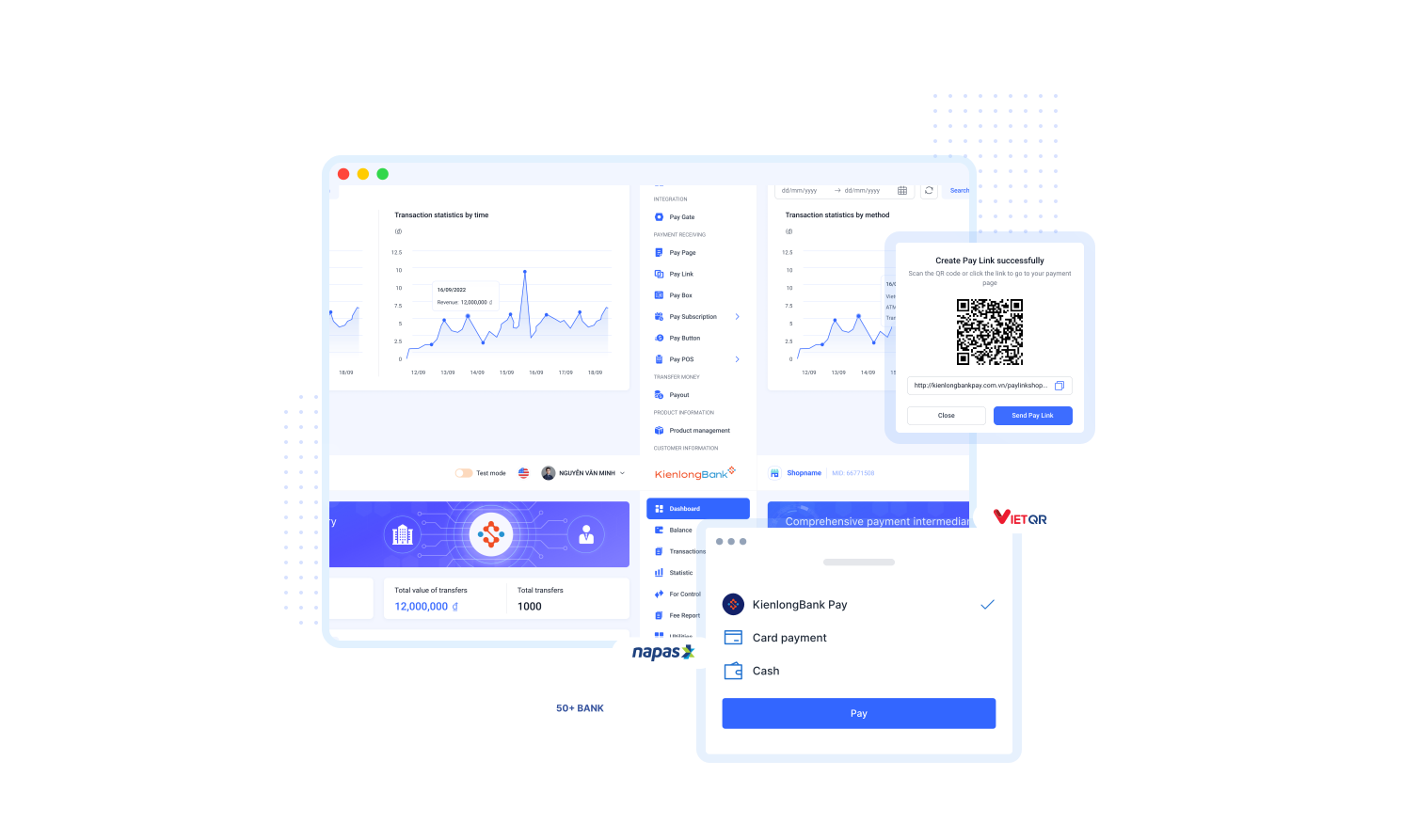
KienlongBank Pay is an integrated payment-gateway product connecting the bank's partner businesses to card, QR, and payment-link rails. The back-office side is where partner-facing staff, employees, and transaction operators handle merchant approval, fee configuration, transaction tracking, and cash-flow reconciliation across multiple parties.
I took over the back-office system from another team already in-flight. The scope was to review the existing product direction, run a UX audit across the six modules that had already been built or scoped, benchmark against comparable payment back-offices, and rework the experience for consistency, clarity, and scale — rather than starting from a blank sheet.
The flagship challenge was making a multi-role, multi-step approval workflow feel coherent rather than bureaucratic — with an audit trail thorough enough for banking compliance, but a UX simple enough that non-technical partner-facing staff don't need training to use it.
DOMAIN
Fintech · Banking back-office
PRODUCT
Payment gateway CMS — multi-module enterprise
ROLE
Lead UX/UI — research, UX, UI, dev handoff
MODULES
6 — partner, employees, fees, transactions, cash flow, PayPOS
METHOD
Product audit · competitor research · IA rework · design system
OUTPUT
Wireframes, prototype, design system, 25+ specs
The problem
Six modules, three roles, one workflow — and no shared operational surface.
Before this pass, the six back-office modules had each grown their own patterns. Partner-facing staff, employees, and transaction operators each needed different data views, but they were reading and writing to the same underlying record — with inconsistent forms, ad-hoc status labels, and navigation that assumed the operator already knew where each module started and ended. Approval steps got lost between teams; reconciliation was a recurring firefight.
FOR THE USER
Partner-facing staff
Approving new merchants meant chasing signatures, KYC docs, and CIF numbers across three internal tools. Errors caught at the bank compliance stage cost 3–5 days of rework.
FOR THE TEAM
Transaction operators
No unified view of pending vs. settled transactions. Reconciliation involved exporting CSVs from three systems and matching by hand.
FOR THE BUSINESS
The bank
No standardized workflow to onboard partners at scale. Every new business line meant a new spreadsheet — and a new audit surface for compliance to review.
Product audit
What the audit surfaced — four buckets of UX debt.
The first phase was a structured review of the existing screens, flows, and stakeholder interviews — with a heuristic pass against Nielsen's ten and a competitor benchmark against comparable payment back-offices. The findings clustered into four themes that the redesign later addressed.
Inconsistent component patterns
Forms, tables, and status displays had drifted per module. A partner-intake form and a fee-configuration form used two different date pickers, two different validation styles, and three different button hierarchies — the same visual vocabulary answered differently on each screen.
Weak module hierarchy
Modules were sequenced in the navigation by build order rather than by operator workflow. First-time users hit Fee Configuration before they had a partner to configure fees for — the mental model didn't match the task order.
Ambiguous transaction states
Pending, processing, in-review, awaiting-settlement, and settled were all treated visually the same way, forcing operators to read the exact state name to differentiate. Status was carried by text alone, not by shape or icon.
Duplicated data entry
Partner records touched by three teams often ended up with three slightly different phone numbers or contact emails, because there was no single record of truth — each module wrote its own copy of the same fields.
COMPETITOR REVIEW · WHAT MATURE BACK-OFFICES DO
Reviewed several comparable payment back-offices to understand how mature platforms handle transaction visibility, partner onboarding, and multi-role workflows. Four patterns surfaced as worth adopting:
- Transaction state uses color + shape + label together — never color alone
- Partner and employee roles are surfaced in the UI, not just enforced in the backend
- Auditability is treated as a first-class UX concern, not a support-team afterthought
- Dashboards reward daily monitoring rather than executive reporting — operators live here
Approach
Kept six modules coherent through shared record, shared library, and research-led IA.
The audit surfaced the same root cause in three different symptoms — six modules had each answered the same design question differently. I anchored the redesign around three shared substrates that stay honest as engineering ships modules in parallel: one canonical partner record, one component library reused across every surface, and an information architecture organized by operational task rather than by org chart.
01
PILLAR — SHARED RECORD
One partner record, six module views
- →Every module reads and writes to the same partner-record schema
- →Views are role-scoped: partner-facing staff see intake state, operators see transaction state
- →Handoff between modules preserves state — no lost approvals mid-flow
- →Every action is journaled with actor, timestamp, and reason
02
PILLAR — DESIGN SYSTEM
Component library tuned for cross-module reuse
- →Typography ramp + color tokens applied across every module
- →Table, form, drawer, and modal patterns reused unchanged
- →Status badges standardized: pending · approved · rejected · settled
- →Icon set shared with the customer-facing Pay Page + Pay Link surface
03
PILLAR — RESEARCH-LED
Grounded in real operator behavior
- →IA driven by task flow, not org chart — modules organized around jobs
- →Usability testing with internal partners refining approval flow copy
- →Every state change carries a reason string so ops never asks 'why?'
One shared record, six module views — operators trust the system because they can trace every action back to its origin.
Process
Five-stage design process from research to test.
Research
User Research, Competitor Analysis
Define
Persona, Journey Map, Problem Statement
Idea
Brainstorming, IA, Userflow
Design
Wireframe, Prototype, UI
Test
User Testing, Screen Evaluation
COMPETITOR ANALYSIS
Research
Benchmarked 3 payment platforms to prioritize what to build first — global reach, local trust, and setup speed.

Global standard for developer flexibility
Reference for API-first architecture and clean transaction flows.

Vietnam-first, business-friendly
Reference for local integrations and real-time analytics UI.

No-code embedded payments
Reference for zero-setup Pay Link, POS, and Pay Button surfaces.
6 CORE FEATURES
Distilled from the teardown into the modules the bank could ship first.
Pay Page
Pay Link
Statistic
Setting
Product
Customer
EMPATHY MAP
Define
2 lines per quadrant — the sharpest signals from interviews, not the full transcript.
Say
- “I'm not sure if my transactions are accurate.”
- “I need a payment gateway I can actually trust.”
Think
- How do I minimize losses vs cash payments?
- Reconciling in Excel every week is killing me.
Do
- Manually verify each transaction against paper receipts.
- Pay for extra staff just to close the books.
Feel
- Pressured by unclear transaction reports.
- Anxious about mismanaging cash flow.
USER PERSONA
Two research anchors that changed the design.
Each persona = one research quote we couldn't design around, one insight, and the specific UI decision it drove.

Barnett
INDEPENDENT RETAIL MERCHANT
29 · Runs a mini supermarket · Excel-based bookkeeping
RESEARCH QUOTE
“I lose sales when a customer wants to pay by e-wallet and I only have cash.”
INSIGHT
Missing a payment method isn't friction — it's a lost order.
Merchants like Barnett aren't asking for more analytics. They're asking for reliable acceptance of the payment method their customer already prefers.
DESIGN RESPONSE
3-tap payment-method setup with revenue preview.
Onboarding flow surfaces e-wallet / card / QR toggles as the first screen — projected uplift shown before commit so the merchant sees the value, not the config.

Amery
MULTI-CHANNEL SERVICE OPERATOR
36 · Runs a travel-services company · Bookings across web + Facebook + Zalo
RESEARCH QUOTE
“My staff send bank details over Zalo. I never know if the transfer actually landed.”
INSIGHT
Multi-channel bookings break the audit loop before payment even settles.
Every off-platform message is an audit gap. Owners can't trust reports they didn't observe end-to-end. Design has to close that loop, not add another dashboard on top.
DESIGN RESPONSE
Auto-linked payment inbox across every channel.
One inbox aggregates chat / web / API bookings into a single settlement view; each booking auto-matches to its bank transfer with a visible trace so no reconciliation happens off-platform.
Key modules
Six modules, each a jobs-to-be-done surface.
01
Partner management
Merchant approval workflow with KYC intake, fee-tier assignment, and CIF resolution. Approval states are auditable end-to-end.
02
Employee management
Role-scoped access for partner staff — assign permissions per module, track sessions, revoke instantly when someone leaves.
03
Fee configuration
Configurable fee tiers per partner, per transaction type. Version-controlled — every change reversible.
04
Transaction operations
Unified view of pending, settled, and failed transactions across all partners. Filter by state, date, channel; export for reconciliation.
05
Cash-flow oversight
Real-time cash-flow dashboard showing inbound partner deposits, outbound settlements, and pending reserves. Alerts for anomalies.
06
PayPOS integration
Bridge module between the back-office and the merchant-facing PayPOS mobile app — partner staff configure PayPOS from the same admin.
Design system & mockups
Shared tokens, one component library, six-module consistency.
DESIGN SYSTEM
Six modules, one library.
Built on Roboto, five text roles, and three color families (primary, neutral, semantic) — the same tokens shipped every module.
TYPOGRAPHY
ROBOTO
| FONT CATEGORY | FONT WEIGHT | FONT SIZE | LINE HEIGHT |
|---|---|---|---|
| Heading | Medium | 20 | 28 |
| Title | Medium | 16 | 24 |
| Body | Normal | 14 | 20 |
| Button | Normal | 14 | 20 |
| Small text | Normal | 12 | 16 |
COLORS
PRIMARY
NEUTRAL
SEMANTIC
GRADIENT
HIGH-FIDELITY MOCKUPS
Key modules, shipped.
Four representative screens from the six-module back-office — one shared component library keeps the pattern consistent across finance, ops, and partner roles.
DASHBOARD
Dashboard
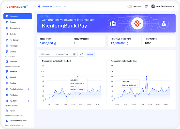
Overview of accounts, balances, transaction history at a glance.
STATISTIC
Statistic
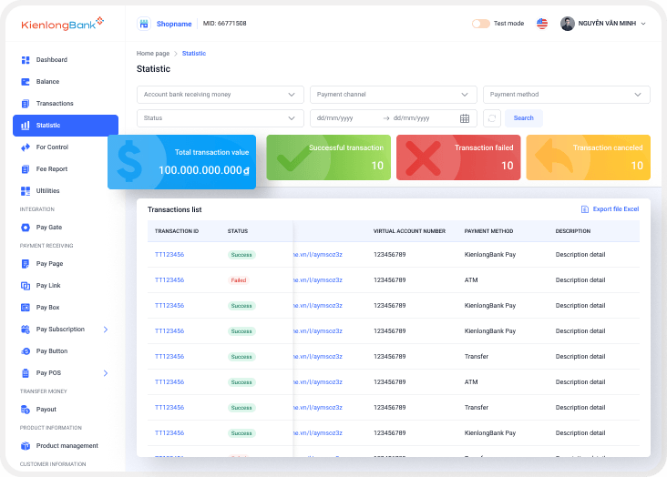
Filterable KPI dashboard — value, success, fail, cancel — with drillable transactions list.
PAY PAGE
Pay Page
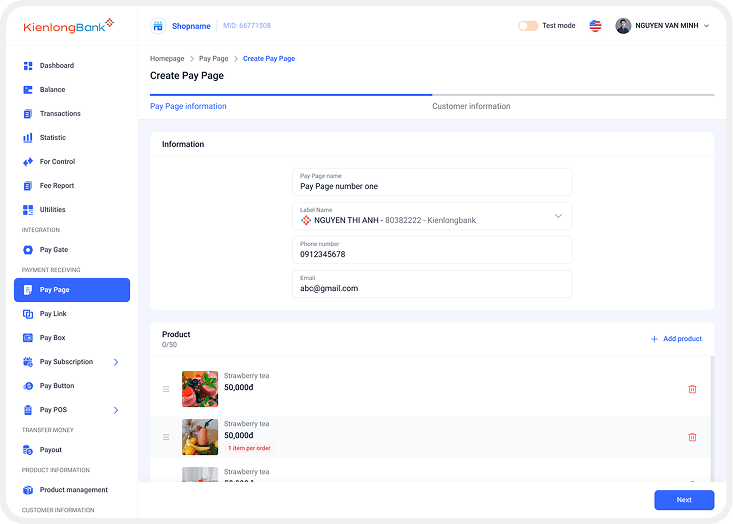
Multi-step payment order creation with customer info + product list.
PAY LINK
Pay Link
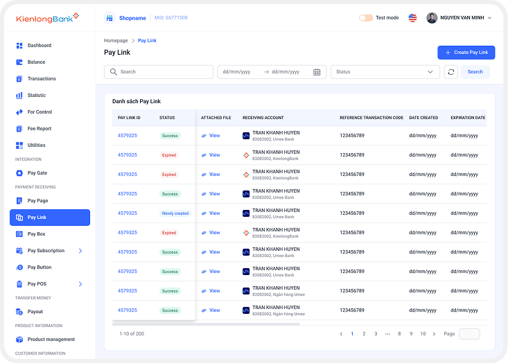
Reusable payment link with QR + status tracking + customer capture.
Validation & accessibility
How the redesign was validated — and how it stayed accessible.
There was no formal usability study on this project — banking back-offices sit behind an internal-user wall, and the timeline didn't allow one. Validation happened through structured stakeholder reviews across the phases the design touched, and accessibility was enforced at the component-library layer so every module inherited the same baseline.
How the redesign was validated
- Walkthroughs with Product Owner, BA, and engineering — checking every flow against the business rules and technical constraints they'd flagged during audit
- Design reviews against the bank's compliance requirements — every state that carries legal weight was reviewed with the compliance stakeholder before shipping
- Cross-module consistency audits — checking that every button, badge, and form pattern resolved back to the same design-system token
- Business-rule alignment sessions with payment-ops and fraud teams to close gaps between the intended workflow and the shipped UI
Feedback from these sessions led to simpler navigation labels, clearer status labels, tighter form grouping, and a refined dashboard hierarchy.
Accessibility baked into the system
- Type ramp meeting readable minimums across data-dense tables and dashboards
- Status labels always icon + text — never color alone — so colorblind operators read the same thing
- Form labels visible above every field at every input width — no floating-label collapse on small viewports
- Focus + interactive states standardized in the component library so keyboard operators see the same feedback everywhere
- Predictable navigation patterns — the same shell across modules so operators build muscle memory once
Because these rules were enforced at the library layer, every module inherited the same baseline without designers re-checking each screen.
COLLABORATION · WHO SHAPED THE DESIGN
Every design decision was aligned with the people who owned the business rules, the code, and the operational reality: Product Owner and Product Manager for scope and priority, Business Analysts for the compliance and workflow rules, Engineering for feasibility and the shared component contract, QA for edge cases the audit had missed, and banking + payment-ops stakeholders for the operational context the earlier team hadn't had time to surface.
Reflection
What this taught me about designing an inherited enterprise product.
Taking over an inherited enterprise product taught me that most of the design work happens before you draw a new screen. The first weeks were almost entirely product audit — mapping how each module actually behaved, where patterns had diverged, and which parts of the workflow the earlier team had chosen not to invest in. That audit is what let the redesign focus on shared substrates rather than surface polish.
Enterprise UX is often about improving an existing system rather than starting from zero. The redesign aimed to make six modules feel like one coherent product for the operator switching between them all day. That coherence came from three levers I'd hit again next time — shared data model, shared component library, and shared vocabulary in the UI copy — and from treating auditability as a UX concern rather than a compliance checkbox.
TAKEAWAY 01 — AUDIT BEFORE ARTIFACT
Understanding what already exists and where it drifts is where most of the value lives. New pixels come after the map is drawn.
TAKEAWAY 02 — CONSISTENCY IS A UX LEVER
In multi-module products, small pattern inconsistencies compound into big cognitive load. A shared library isn't decoration — it's the operator's memory.
TAKEAWAY 03 — DESIGN FOR THE HAND-OFF
Enterprise design isn't finished in Figma. It's finished when engineering can ship a new module in the same shell without asking a designer to define every state.