Fintech · Payroll on demand
Earned Wage Access — pay workers 24/7, on the wages they already earned.
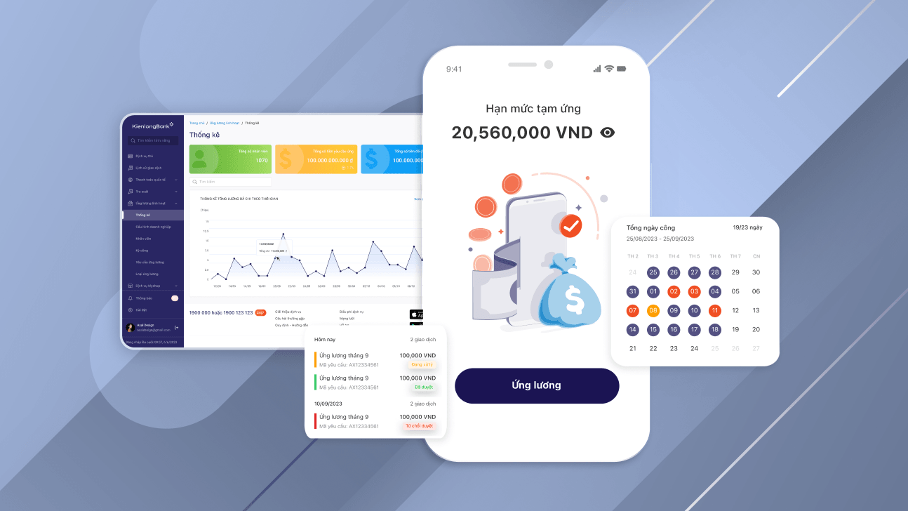
Designed the two touchpoints I owned in this B2B2C payroll workflow — the worker mobile app and the HR admin portal — letting employees withdraw earned wages anytime without payday loans.
ROLE
Sole UX/UI Designer
PLATFORMS
2 · mobile + web admin
METHOD
Stakeholder validation · flow reviews · design critiques
FOCUS
Connected workflow across worker + admin
Project overview
About Earned Wage Access
An on-demand pay solution by KienlongBank — letting workers withdraw a portion of their already-earned wages anytime, 24/7, without waiting for the regular payday.
The wider ecosystem is B2B2C, but my design scope focused on the two touchpoints that own the withdrawal workflow — the worker mobile app and the HR admin portal. Together they replace ad-hoc payday loans with a controlled, auditable request-and-approval loop.
On these two products I owned UX end-to-end: research, information architecture, user flows, wireframes, prototypes, high-fidelity UI, and dev handoff.
DOMAIN
Fintech · Payroll / HR
ROLE
Sole UX/UI — research, UX, UI, dev handoff
PLATFORMS
2 — worker mobile app · HR admin portal
TEAM
Product owner + engineering
METHOD
Stakeholder walkthroughs · prototype reviews · flow reviews
DELIVERABLES
Flows, wireframes, prototype, design specs
The problem
Workers needed faster access to wages they had already earned.
Traditional monthly payroll left many workers cash-strapped mid-month. Without a fast, trustworthy way to draw earned wages, they often turned to short-term loans with high interest — creating a financial-stress loop the company wanted to break for its partner employees.
FOR USERS
Workers
Unpredictable cash needs mid-month. With no structured way to access earned wages early, many fell into payday-loan debt cycles.
FOR ADMINS
HR & companies
Manual advance requests created paperwork burden, inconsistent approval rules, and no clear audit trail of who borrowed how much.
FOR THE BUSINESS
The bank
No standardized B2B2C workflow to deliver earned-wage services at scale across multiple partner companies.
Product constraints
The rules that shaped every design decision.
An Earned Wage Access product sits inside a live payroll system — every screen has to respect the underlying financial and operational rules. These constraints weren't obstacles to design around; they were the shape of the product itself.
Payroll cycle
Withdrawal windows had to align with the company's payroll close date. Requests during cutoff windows behave differently than requests early in the month.
Salary calculation
Earned wage is a computed value — accrued days × daily rate, minus prior withdrawals, minus deductions, capped at a company-defined percentage. The UI never invents a number.
Employer approval
Some companies auto-approve; others require HR review. The same request UI has to render both flows without confusing the worker about what happens next.
Available balance
'Earned' is what you've worked for. 'Available' is what you can withdraw right now. These are two different numbers and the copy has to keep them apart.
Transaction status
Pending, approved, rejected, processing, sent, received, failed — every state maps to a specific place in the payroll + banking pipeline and needs its own label.
Banking transfer
The actual money move is on third-party bank rails with their own SLAs. The UX has to hold the worker's trust across a gap the design doesn't fully control.
Permission & role control
Worker sees their own record only. HR sees their company. Admin sees the platform. The same schema, three visibility layers — enforced in the UI, not just the API.
Audit trail
Every state change carries actor, timestamp, and reason. This isn't decorative — it's what makes the product usable by compliance and finance teams downstream.
Data consistency across surfaces
The worker's request and the HR's queue item are the same record seen from two angles. State on one side must be truthful on the other — always.
Stakeholder map
A connected workflow, not a mobile app.
Every withdrawal touches at least five parties in sequence. Understanding what each party needs, owns, and cares about is what turned "design a mobile app" into design a payroll workflow that has a mobile face.
Worker / employee
- NEEDS
- A trustworthy way to check what they've earned and request part of it before payday.
- OWNS
- Their own withdrawal history and request state.
- CARES ABOUT
- Balance clarity, request status, expected arrival time.
Employer / HR admin
- NEEDS
- A control surface to configure policy and process requests without spreadsheets.
- OWNS
- Company withdrawal policy, employee eligibility, request approvals.
- CARES ABOUT
- Volume of requests, exceptions, monthly reconciliation.
Payroll / finance team
- NEEDS
- Reliable per-employee deduction records that flow back into the monthly payroll run.
- OWNS
- Deductions, reconciliation, month-end close.
- CARES ABOUT
- Data integrity, timing against payroll cutoff, no manual patches.
Banking / payment provider
- NEEDS
- Valid transfer instructions and a callback to confirm settlement.
- OWNS
- The actual money movement on bank rails.
- CARES ABOUT
- Correct amount, valid account, retry / failure handling.
Product / operations team
- NEEDS
- Visibility into what's happening across the system so edge cases don't reach the worker as silent failures.
- OWNS
- Monitoring, exception handling, support paths.
- CARES ABOUT
- Failed transfers, stuck approvals, disputed requests.
Compliance & audit
- NEEDS
- A journal of who did what, when, and why — accessible without engineering support.
- OWNS
- Regulatory posture on wage advances.
- CARES ABOUT
- Auditability, actor + timestamp + reason on every state change.
End-to-end workflow
One request travels through seven checkpoints.
A withdrawal starts as a tap in the worker's hand and ends as a settled transfer in their bank account — with five intermediate states each owned by a different team. The UI has to make the current position on this path visible on both surfaces at all times.
01
WORKER
Check available wage
02
WORKER
Submit request
03
HR ADMIN
System / HR validation
04
FINANCE
Payroll record check
05
BANK
Payment processed
06
WORKER
Worker receives money
07
SYSTEM
Status updated across surfaces
Approach
Designing two key touchpoints in a connected payroll workflow.
Although the Earned Wage Access ecosystem includes multiple touchpoints, my design scope focused on the worker mobile app and the company admin portal. The worker initiates a withdrawal through the app, while HR reviews and manages requests in the portal. I designed both around the same information architecture and business rules to keep the workflow consistent between employees and administrators.
01
Worker mobile app
The primary experience where employees can view their earned wages and request withdrawals anytime. The flow was optimized to minimize friction, letting users complete a withdrawal request in just a few steps.
KEY JOBS
- →View available earned wage balance
- →Request a withdrawal in 3 taps
- →Track request status and history
- →Receive notifications after approval
02
Company admin portal
A management portal that enables HR teams to configure earned-wage policies and process employee withdrawal requests efficiently.
KEY JOBS
- →Configure withdrawal rules and limits
- →Review, approve or reject requests
- →Manage employees and withdrawal limits
- →Export payroll reconciliation reports
High-fidelity mockups
How the two surfaces render the shared workflow.
The HR admin portal holds the configuration, approval queues, and reporting — the surface where policy is set and requests are managed. The employee mobile app is where the worker checks their earned balance, submits a request, and tracks status. Both read from the same record, so state on one side is always truthful on the other.
01 · WEB · HR / ADMIN
Admin portal
Configure withdrawal policy · Review approval queue · Manage employees + limits · Export reconciliation reports.
02 · MOBILE · WORKER
Employee app
Check earned + available balance · Submit a withdrawal request · Track request status · Receive notifications after approval.
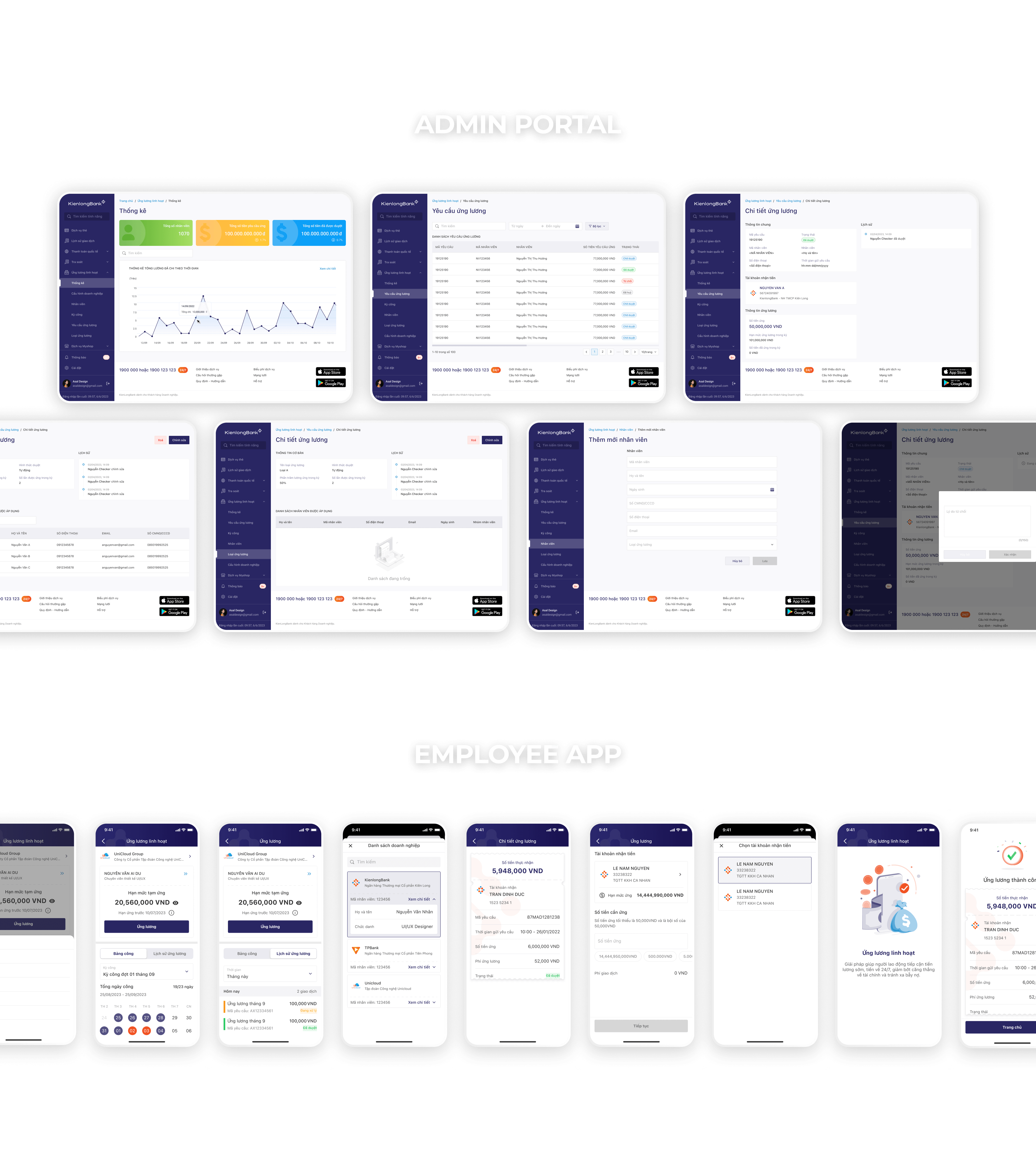
High-fidelity mockups — HR admin portal (top) and employee mobile app (bottom)
Design the data model before the UI — two roles seeing one shared record is the honest broker.
Component thinking
A shared pattern library across worker and admin.
To keep the two surfaces from drifting into different products, I designed the visual + interaction patterns once and reused them across both. The same request card, the same status vocabulary, the same empty state — read the same way on a phone in a worker's hand and a browser on an HR desk.
Request status component
One badge design, one color-shape-label mapping, one set of states — pending, approved, rejected, processing, sent, received, failed. Reused unchanged on both surfaces.
Tables + filters
Admin queue tables use one table primitive with a shared filter model. Adding a new column or filter type doesn't force a re-design.
Form structures
Same field groups, same validation copy, same helper-text pattern across worker request form and admin policy form. Field labels stay above the input at every breakpoint.
Timeline / history
A single event-log primitive renders the worker's request history and the admin's audit trail — both read as the same story from different angles.
Balance & summary cards
One card family for money-related values with strict rules for label + amount + unit + secondary context, so 'earned' and 'available' can never render the same way by accident.
State vocabulary
Empty, loading, pending, success, failure, and rejected states each have a design + copy pattern. New screens compose from these instead of inventing per-screen states.
Validation
How the design was validated without formal user testing.
A B2B2C payroll product sits behind an NDA wall — direct access to end workers wasn't feasible in the design phase, and the timeline didn't support a formal usability study. Validation happened through the review paths that were available: stakeholder walkthroughs, prototype critiques, and flow reviews with the people who owned the business rules and the code.
Each review focused on a different lens — Product Owner and BA on business rules, engineering on feasibility, payroll and finance on record integrity, operations on edge cases. Feedback from these sessions refined the design before the first line of production code shipped.
REFINED AFTER FEEDBACK
Simplified request form — trimmed optional fields flagged by the product owner as adding friction without adding audit value.
REFINED AFTER FEEDBACK
Clearer status naming — 'processing' vs 'sent' vs 'received' surfaced after payment-ops walked through the actual bank-callback flow.
REFINED AFTER FEEDBACK
Improved admin filtering — HR flagged that batch approval across many workers needed status + date + department filters together.
REFINED AFTER FEEDBACK
Clearer balance explanation — payroll team highlighted the risk of confusing 'earned' with 'available'; the balance card rewrote to keep both visible together.
COLLABORATION · WHO SHAPED THE DESIGN
Design decisions were reviewed against three lenses at every checkpoint: business rules with the Product Owner, Product Manager, and Business Analyst; technical feasibility with engineering — including which states the payroll + banking APIs could actually surface; and operational reality with the payroll / finance team, operations, and QA. Each conversation shifted the design closer to a workflow the whole system could sustain, not just a UI that looked right.
Reflection
What designing a payroll product taught me about enterprise UX.
Payroll-related products are less about isolated screens and more about preserving data integrity across connected systems. One worker action can affect HR, payroll, finance, and payment operations in sequence, so the UX has to make every state clear and traceable — on both the worker's phone and the HR admin's browser, at the same time, with the same meaning.
The design work that mattered most on this project was the work that happened before any high-fidelity screen: mapping constraints, drawing the workflow, naming stakeholders and what they owned, deciding the vocabulary for status. When those foundations were honest, the two surfaces almost designed themselves. When they were fuzzy, no amount of visual polish covered it up.
TAKEAWAY 01 — CONNECTED SYSTEMS, NOT SCREENS
Enterprise UX in payroll is about maintaining workflow consistency across worker, HR, payroll, banking, and operations — not about designing individual screens in isolation.
TAKEAWAY 02 — TRUST IS BUILT ON STATUS CLARITY
In a financial product, worker trust lives in the status field. If they can't tell what happened to their request, no amount of visual polish makes up for it.
TAKEAWAY 03 — DATA INTEGRITY IS THE UX
The worker's request and the HR's queue item are the same record seen from two angles. Designing that record honestly is 80% of the work — the two surfaces are what falls out of that decision.