B2B Retail · Mobile POS
EzPOS — fast card & QR payments, designed for the merchant in motion.
Mobile point-of-sale app for retail merchants — quick card & QR payments, transaction history, and a simplified end-of-day reconciliation flow that fits in 3 minutes.
ROLE
Sole UX/UI Designer
PLATFORM
iOS · Android
PROCESS
7-step full UX cycle
OUTPUT
30+ screens · design system
Project overview
About EzPOS
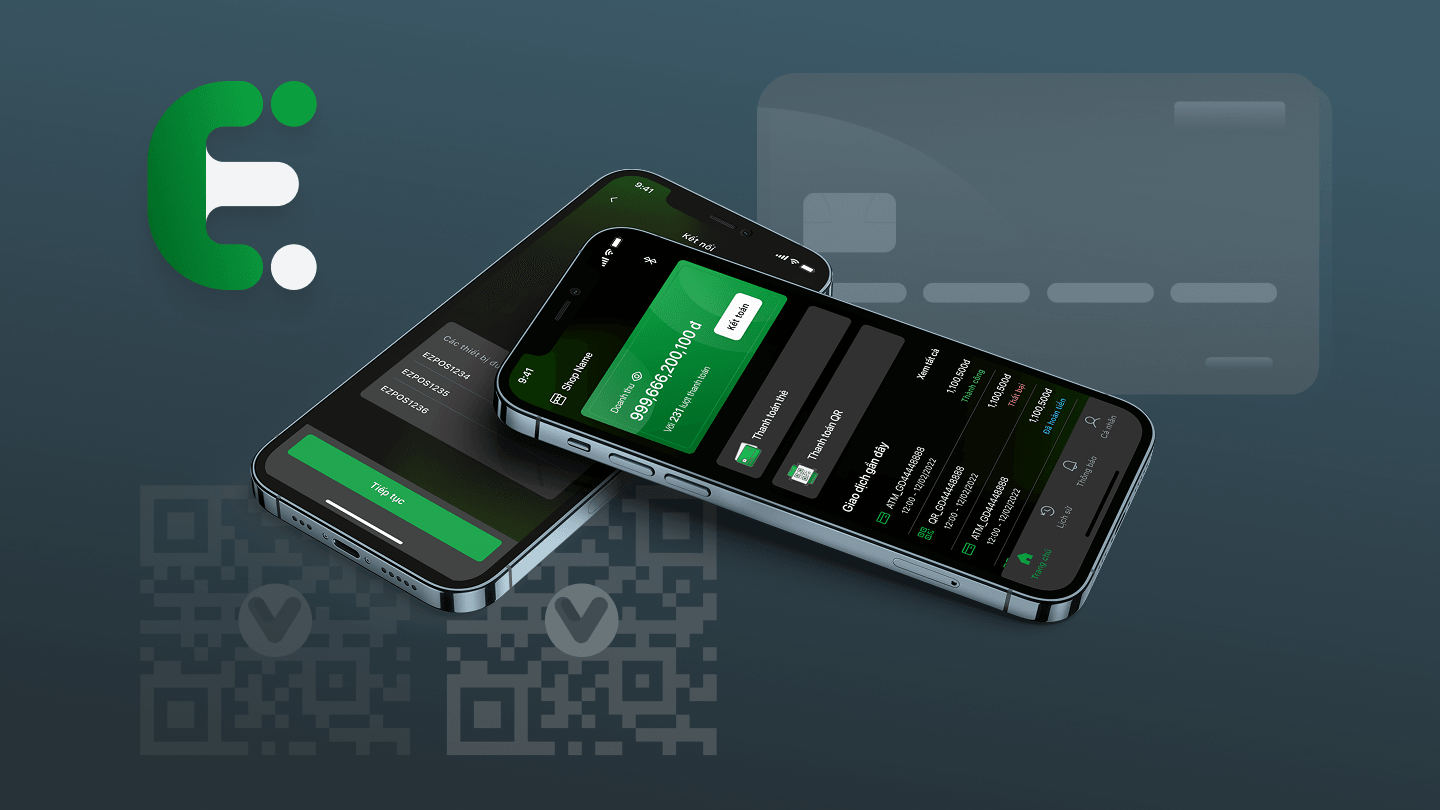
EzPOS is a mobile fintech payment product for retail merchants — handling card payments, QR checkout, transaction history, and daily reconciliation from a single phone the merchant carries between the counter, the market stall, and delivery runs.
This wasn't a visual redesign — it was a payment workflow problem. Every screen has to serve a merchant who is often holding a product in one hand and the phone in the other, in a noisy environment, on an unstable network, with a customer waiting.
I led the end-to-end UX process — competitive analysis of mPOS.vn, Payoo, and Square, moodboarding, user flows, wireframing, prototyping, design system, high-fidelity UI, and developer handoff. The visual identity leans dark with a green accent — chosen after moodboarding for outdoor legibility at market stalls and small-shop storefronts.
DOMAIN
Retail · Mobile POS
PRODUCT
Mobile payment app for merchants
ROLE
Sole UX/UI — research, UX, UI, dev handoff
PLATFORM
Mobile (iOS / Android)
PROCESS
7 steps — competitor analysis → high-fi UI
OUTPUT
30+ screen mobile app + design system
The problem
Merchants needed fast, one-handed checkout — at the counter, at markets, on the move.
Small retail merchants juggle cash, cards, QR payments, and receipts — all while the next customer is already at the counter. Existing POS apps assumed a stationary setup and a two-handed operator. Neither assumption held for the target user.
FOR THE USER
Merchants
Split attention between customer, product, and app. Two-handed POS flows dropped transactions when the merchant needed a free hand for the item.
FOR THE BUSINESS
Multi-shop owners
End-of-day reconciliation across multiple staff and shifts was a 20-minute manual export-and-match. No unified daily summary.
FOR THE PLATFORM
The payment provider
No consistent transaction UI across merchant apps meant repeated support burden — every shop asked the same 5 questions.
Merchant constraints
The reality every screen had to survive.
A merchant payment app doesn't get to assume a quiet room, a stable network, and a two-handed operator. The operating environment shaped every design decision — sometimes more than the feature list did.
Speed at the counter
The customer is waiting. Each payment has to complete in seconds, not steps. The design has to reduce hesitation at the moment of payment.
One-hand operation
The merchant often holds a product or receipt in the other hand. Every primary action must be reachable with the thumb of the hand already on the phone.
Noisy, distracting environment
Markets, small shops, delivery runs. The interface can't rely on subtle motion or quiet copy — critical states need to read at a glance in bright light and busy backgrounds.
Unstable network
Payment flows have to communicate what the app knows and what it doesn't. A pending state is not a failure — but it must never look like success either.
Payment status clarity
Merchant + customer both watch the same screen at the moment of truth. Success and failure need immediate, unambiguous visual language — no room for interpretation.
Failure recovery
When something fails — network drop, card decline, QR timeout — the merchant needs a one-tap path to retry or fall back to a different method, without losing the amount.
History at reach
"Did that last payment go through?" is asked constantly. Transaction history has to be one tap away and readable at a glance.
Daily reconciliation
End-of-day the merchant needs to close out — total revenue, count by method, disputed transactions. This isn't a report screen; it's part of the daily rhythm.
Trust in a financial product
Every money-moving screen carries a trust cost. Confidence comes from consistency: same status vocabulary, same confirmation language, same recovery affordance across every payment method.
Merchant workflow
A single payment travels nine checkpoints in under a minute.
The whole product hangs on this loop. Getting the sequence right — and making the state visible at every step — mattered more than any individual screen.
01
Idle
Open app
02
Card / QR
Choose payment method
03
Input
Enter amount
04
Processing
Generate QR / process card
05
Awaiting
Confirm payment
06
Success / Fail
Show payment result
07
Recorded
Issue receipt / save txn
08
Review
Review history
09
Close-out
Reconcile daily revenue
Process
Seven-step design process — from competitor research to developer handoff.
My process began with analyzing mPOS.vn, Payoo, and Square to understand common payment flows, merchant workflows, and UI patterns before defining opportunities for EzPOS. Each step fed into the next, with the earlier steps re-visited when later steps surfaced new assumptions.
01
VN · Domestic referencemPOS.vn
Studied for
Payment flow, POS device connectivity, transaction management
02
VN · Merchant leaderPayoo
Studied for
QR payments, transaction history, merchant-facing experience
03
US · Global benchmarkSquare
Studied for
One-handed checkout, design system rigor, modern POS flow
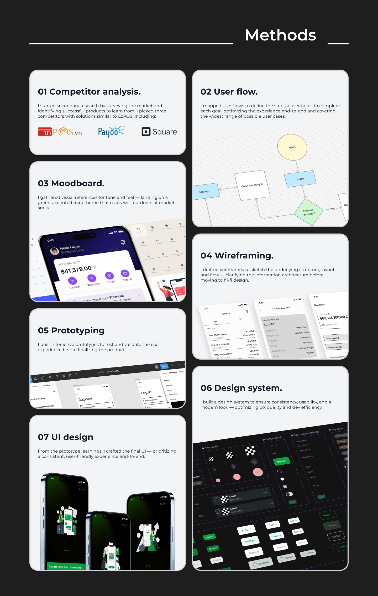
Process visual — 7 methods from competitor analysis to UI design
Merchants have one hand for the phone and one for the product. Primary actions belong in the bottom third of every screen.
Design decisions
What I decided — and why.
Six choices carried most of the weight. Each was resolved by asking the same question — what does this merchant, in this moment, actually need?
DECISION
Separate card and QR payment flows
WHY
Card and QR run on different mental models — card is a physical action (tap / insert), QR is a scan-or-show. Merging them into one flow forced merchants to re-read the screen each time. Splitting them at the entry point lets each flow render only what's relevant to that method.
DECISION
Primary CTA in the thumb zone
WHY
The merchant is already holding the phone in the hand that will tap the CTA. Placing 'Confirm' or 'Charge' in the bottom third of every screen means the payment can be completed without shifting grip — which matters when the other hand is holding the customer's product.
DECISION
Dashboard leads with revenue + recent transactions
WHY
The two questions merchants open the app to answer are 'how much did I make today?' and 'did that last payment go through?'. The dashboard answers both above the fold — everything else lives one tap away.
DECISION
Payment status = shape + color + label together
WHY
In a bright market or a busy shop, color alone fails. Every status — pending, processing, success, failed — carries a shape (icon), a color, and a label. Three redundant signals so the merchant reads the state at a glance even in awkward lighting.
DECISION
Transaction history with filter-first design
WHY
The list gets long fast. A filter row above the list (date · method · status) is faster than scrolling, and the filter chips double as a visual summary of what the merchant is currently looking at.
DECISION
Dark theme with green accent
WHY
Payment moments are high-contrast — the merchant looks at the screen briefly, in bright outdoor light, then back at the customer. A dark canvas makes the accented CTA and status pop harder than a light theme would; the green reads well outdoors and doesn't wash out under sun.
Payment states & edge cases
Six states, seven edge cases, one status vocabulary.
A payment app fails badly if a merchant can't tell whether the money moved. I defined six canonical states that any transaction can be in — plus a set of edge cases the design has to handle without falling back to \"something went wrong.\"
STATE
Pending
Waiting for the customer or the payment method.
STATE
Processing
Sent to the payment provider; waiting for the result.
STATE
Success
Confirmed by the provider. Money moved.
STATE
Failed
Explicit failure from the provider or timeout.
STATE
Refunded
Merchant-initiated reversal of a completed txn.
STATE
Cancelled
Merchant or customer aborted before completion.
EDGE CASES · WHERE THE DESIGN HAS TO HOLD
- Unstable network mid-payment — hold state, don't fake success
- Duplicate payment attempt — detect + confirm before charging twice
- Failed QR scan — offer manual entry or fall back to card
- Card transaction error — surface provider reason + one-tap retry
- App closed during processing — resume state on re-open, don't lose the amount
- Merchant verifies a transaction later — deep-link from history to a self-contained detail view
- Refund on a failed txn — block; refund only on completed payments
Component thinking
A mobile pattern library, tuned for the same screen used 200× a day.
The merchant looks at these components thousands of times a month. They had to be consistent, reusable, and readable at speed — every new screen composes from the same building blocks so nothing surprises the muscle memory.
Payment method cards
Card, QR, cash — same shape, same tap target, same visual weight. The merchant chooses in a glance, not by reading.
Bottom navigation
Four tabs, thumb-reachable — Home, Pay, History, Settings. Same on every screen so re-entry is muscle memory.
Transaction list item
Amount + method + status + time — always in the same order, same alignment. Scanning a list of 100 is a single sweep of the eye.
Status badge
Icon + color + label. One badge design carries all six states; the state name never renders alone.
Amount input
Full-width, large, thumb-typed. Currency and denomination handled by input mask so the merchant can't enter a malformed number.
Confirmation modal
One primary action, one secondary. Amount + method summarized above the fold. No decorative content between the merchant and the tap.
Receipt / result screen
Same layout for success and failure — only the icon, color, and copy change. Familiar structure means no re-orientation at a critical moment.
Empty + error states
Every screen has its empty (no transactions today) and error (network lost, provider timeout) state. Composed from the same primitives so they never look like bugs.
Toast + banner
Toast for transient info, banner for state the merchant needs to act on. Never confuse them — a merchant reading a toast expecting a banner is a support ticket.
Final UI
High-fidelity mockups — dark theme, green accent, one-thumb tuned.
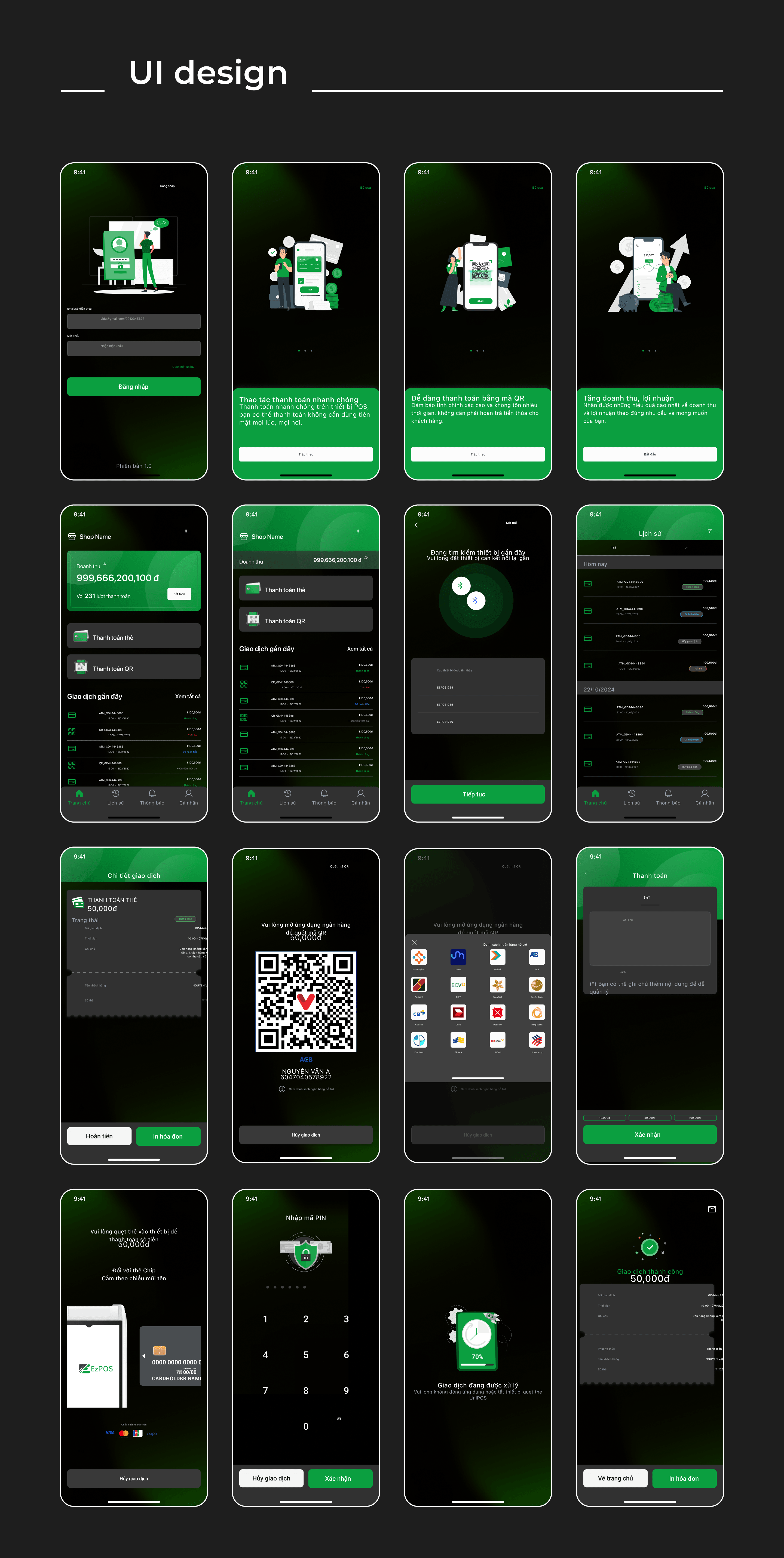
Final UI — mobile POS screens across the checkout, history, and settings flows
Validation & collaboration
How the design was validated — without formal user studies.
Merchant time is expensive and hard to book. The design was validated through the review paths that were available — prototype walkthroughs, design critiques, and stakeholder reviews — with each session focused on a specific lens the design had to survive.
Validation activities
- Prototype walkthroughs with the product team — running the whole payment loop end-to-end on a phone in hand
- Design reviews with product / business — checking payment logic against the real provider rules
- One-handed reachability check — testing every primary CTA against actual thumb reach on a 6″ phone
- Payment-flow review with stakeholders — walking through card + QR + failure paths side by side
- Dark-theme readability review — checking contrast + type in outdoor light conditions with a real phone
- Transaction-status clarity review — testing whether success / failure / pending read at a glance without reading the label
Refined after feedback
- Clearer payment status labels — 'Waiting' → 'Processing' and 'Confirmed' → 'Paid' after the product owner flagged operator confusion
- Stronger success + failure states — added icon + color + label together after the review team noticed color alone got lost in bright light
- Simplified checkout flow — trimmed a confirmation step where the confirmation was already implicit in the amount input
- Transaction list readability — moved status to the leading edge after the review flagged that the amount pulled the eye first
- Refined CTA placement — nudged primary buttons deeper into the thumb zone after one-handed reachability checks
- Payment-method entry — split card + QR at the entry point instead of a shared amount screen after stakeholder review
COLLABORATION · WHO SHAPED THE DESIGN
Design decisions were aligned against three lenses at every checkpoint: payment rules with the Product Owner, Product Manager, and Business Analyst — what the payment provider actually returns and when; technical feasibility with engineering and QA — which states the SDK could reliably surface, which edge cases could actually happen in production; and merchant operations with business + payment stakeholders — how a real shop closes a day, what a support ticket usually looks like, where confidence breaks down.
Reflection
What designing a merchant payment product taught me about UX.
Merchant payment UX is less about adding more features and more about reducing hesitation at the moment of payment. When a merchant is serving a customer, the interface has to make the next action obvious, the payment status clear, and recovery from errors simple. Everything else — visual polish, animation, decorative content — is subordinate to that.
The design work that mattered most on this project happened before any high-fidelity screen: mapping the merchant's constraints, drawing the payment workflow, naming the states, deciding the vocabulary of confirmation and recovery. When those foundations were honest, the visual system had a shape to fill. When they were fuzzy, no dark theme or green accent covered it up.
TAKEAWAY 01 — SPEED IS THE FEATURE
In a merchant payment product, the shortest path from open-app to money-moved is the whole product. Every decorative element gets weighed against how much it slows down that path.
TAKEAWAY 02 — STATUS CARRIES TRUST
In a financial product, worker trust lives in the status field. Success + failure need shape + color + label together, not any one alone — the merchant reads the state before they read the words.
TAKEAWAY 03 — DESIGN FOR THE MERCHANT'S HAND
One-hand operation isn't a nice-to-have — it's the actual usage pattern. Primary actions belong in the bottom third of every screen, and the design has to survive noise, sun, and an unstable network.